

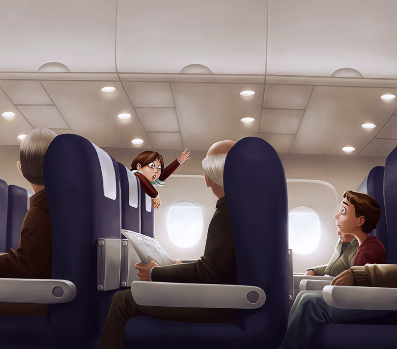

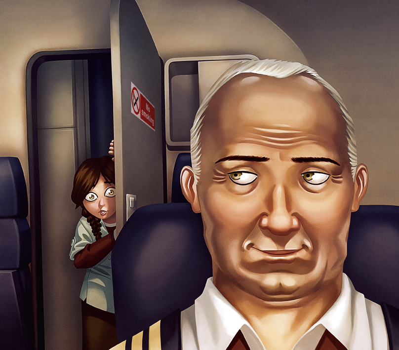

This book was illustrated for Ghayaat and released in the Abu Dhabi International Book Fair. It's the second kid's book I worked on that revolves around a little girl (the titular Hind) and how reading affects her life. The difference is that this book starts out with Hind forgetting her stories at the airport, leading the remainder of the story to explore her interactions with the other passengers and how they cheer her up by bringing up different ways to tell/hear a story (such as making it up yourself). The best thing about illustrating this book was how nosey and curious Hind was.
The process on this book was very different from what I've become accustomed to. Usually, I prefer breaking down the story myself so it was a bit of a challenge to try and figure out how to visualize the description assigned for each page/spread. Given that everything takes place on a plane, it was difficult figuring out how to block the action clearly considering that there were always chairs in everyone's way.
The other challenge on this book was the amount of detail that was requested in the amount of time that I ended up having for coloring (twelve drawings in two weeks). Needless to say, this book led to many discoveries in the late hours of the night. By the time I got to the last page, I decided I wanted to try and document what I was doing so here's a brief overview:


Overall, it was a very similar process to the sort of work I've done before with ink wash except that the final execution was entirely digital. The first step was to select all the individual elements and place them on separate layers. The benefit of that was the ability to select everything easily and create a constrained area while painting in the details for every character. It's also a good way to cheat by letting a brushstroke keep going for the parts of a layer that are covered by another overlapping layer.
After everything is painted in greyscale, the image is flattened, saved as a new file and a texture is placed over it (preferably with the "soft light" blending mode). After it's textured, it's given a color cast to determine the basic light quality. I usually do that by first going to "Hue/Saturation" and using the "Colorize" option and then going into "Levels" and messing with the separate channels to give the different tonalities a variation in hue to try and match the feel of how film is affected by different temperatures.
The final step is to add color. What I do is bring back my original layers at this point because they're already organized and named selections. I use these selections to place a flat color over every item (or part of it). I place the layer of color of in "Soft Light"so that the color is affected by the color cast already present in the image. The benefit of this is that it saves a lot of time that would have otherwise been spent guessing what something might look like under a certain light setting. Sometimes, the results are surprising so it's a technique I'd highly recommend...
I want copies from all the books you've illustrated, including this AMAZING one of course :D
ReplyDeleteI'm still waiting to get copies of all the books I've ever illustrated :P
ReplyDelete